Vietnam has a fast-growing young, middle-class population with a sizable amount of disposable income.
Traditionally Vietnamese entertained at nightclubs and bars, but with the “social evils” of these places giving modern (yet conservative) Vietnamese a bad name, beer clubs came into being.
A natural offshoot of traditional bia hoi, fresh beer that’s brewed daily and consumed on the sidewalk, beer clubs were the modern equivalent, taking the traditional beer drinking quan upmarket with air conditioning, good food, a comfortable environment, and an opportunity to talk to your friends, colleagues, or business associates without the stigma (or ear aches) of nightclubs and bars.
With a background in F & B gained from running McDonald’s’ operations in southeast Asia, notably Indonesia, the Client brought that same attention to detail and understanding of the market to his latest venture, a beer club in Vietnam.
With a massive influx of beer clubs in the market, this beer club needed to stand out to succeed.
With a keen understanding of the beer market and beer clubs, we sought to differentiate ourselves from the cliche and hipster design that permeated the environment with something bold and distinctive.
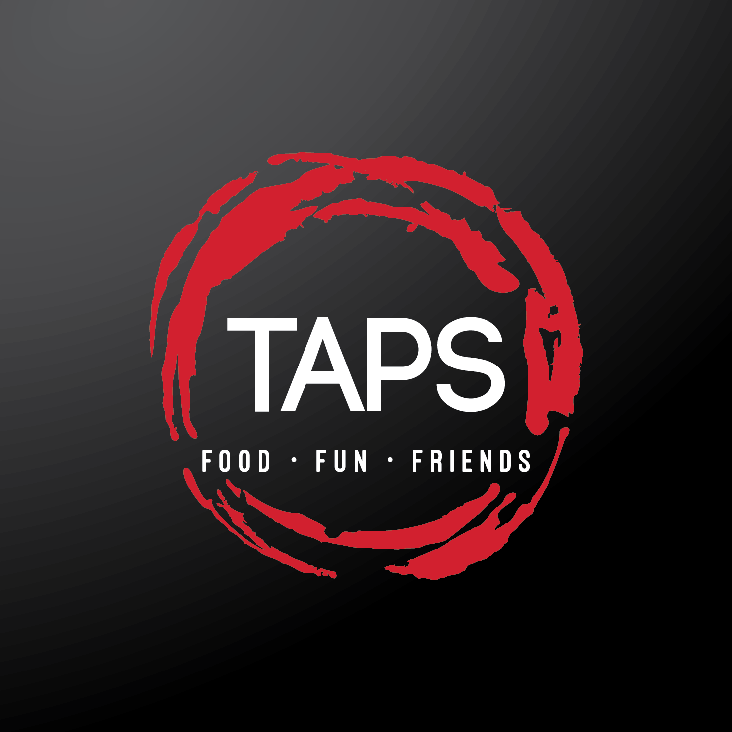
We focused on Taps' Key Offerings: good food, good beer, and a great place to entertain friends.
The Brand Strategy sought to encapsulate these Key Offerings into a symbol that also represented the business’ key focus, beer, via 3 overlapping water rings that represented the Key Offerings, as well as the water rings from cold beer glasses.
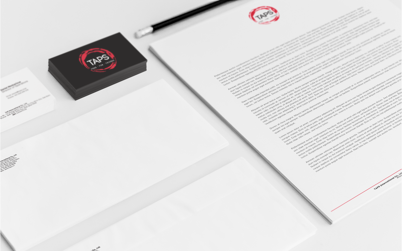
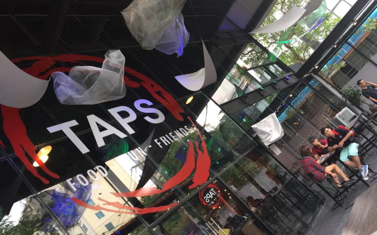
I worked with the Client to establish not only the Brand Strategy and Brand Identity, but also an overall Brand Visual Language that could be implemented across various touchpoints, ranging from traditional business system items to signage.