I originally began working with Red Rock Lager on some updates to their packaging design. The management team, having worked with me previously on bringing Gauden to market, asked me to assist with revamp the Red Rock brand to bring it more in line with its brand personality.
Red Rock Lager had started in Singapore and as such, had no real connection to Vietnam. Over the years they had developed and nurtured a strong connection with the live music scene in Vietnam. Their current branding failed to connect with their target audience on a visceral level.

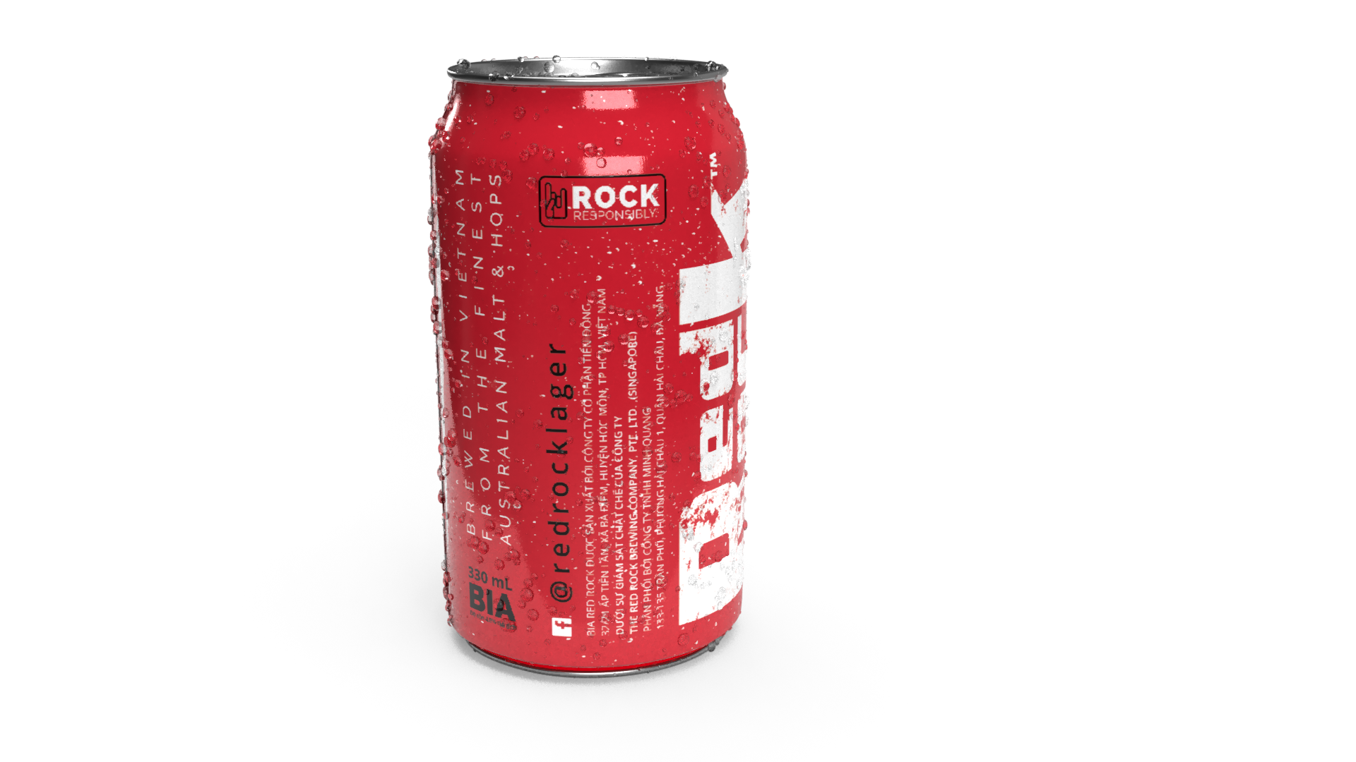
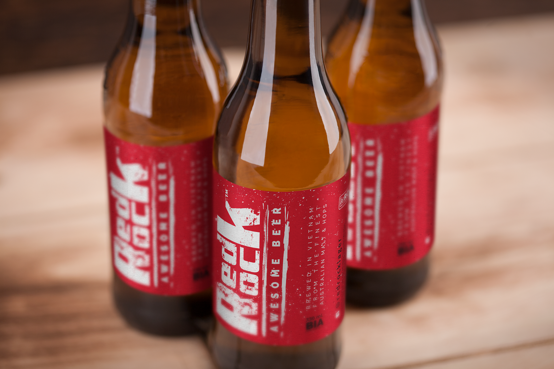
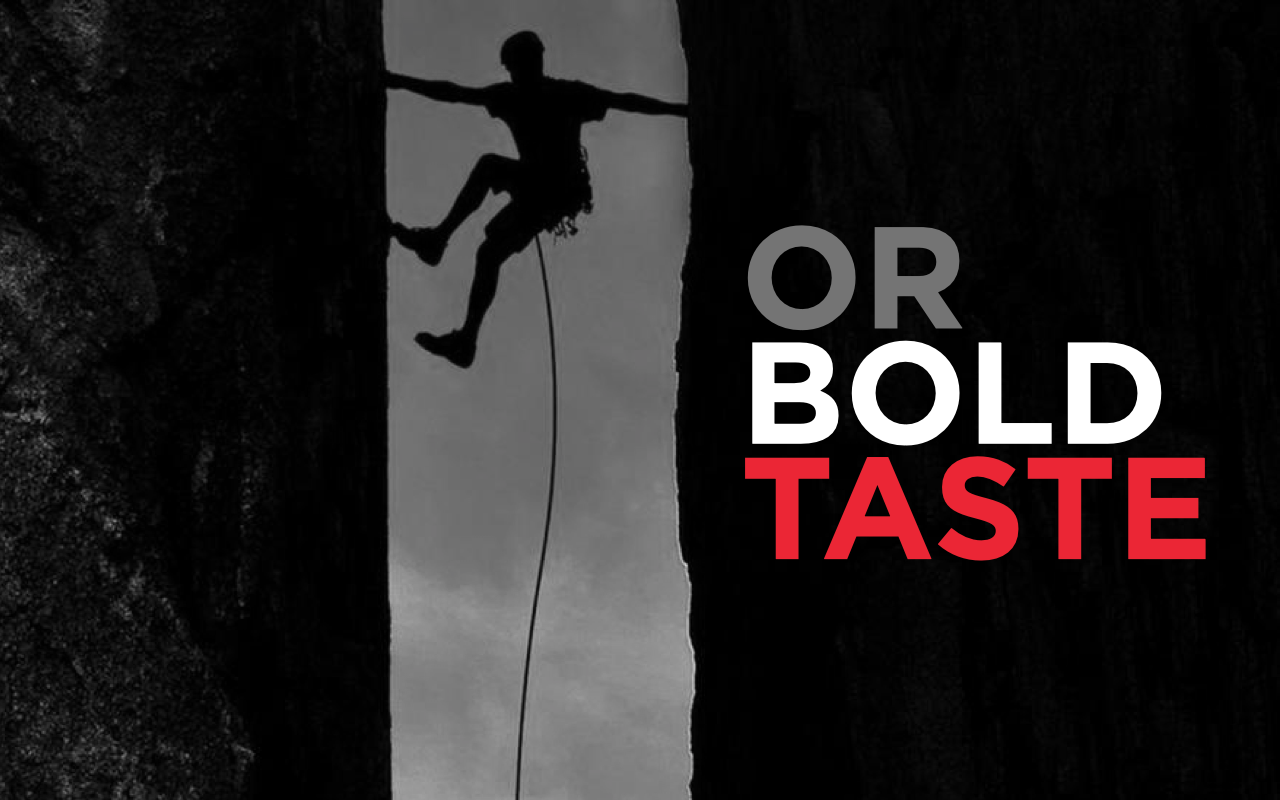
I worked with the client to once again develop a Brand Story - something that had truth to it. We chose a direction that reflected the grungy alt-rock scene that Red Rock was so involved with, and revised the branding and packaging.
We developed an all-new Packaging Design Strategy and executed it across the range of bottles, cans, and carton boxes to ensure brand consistency and to enable Red Rock to capitalize on their updated brand image.