
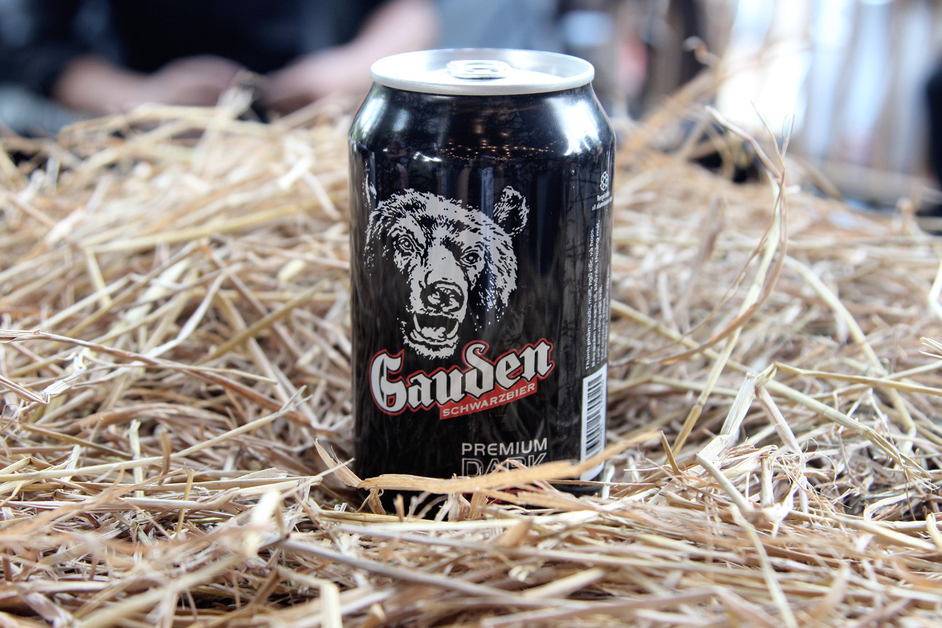
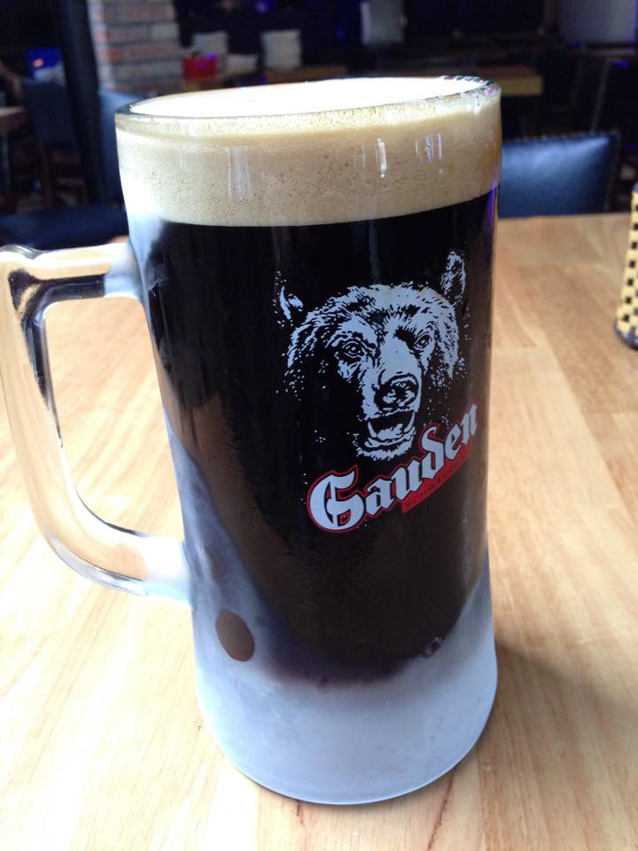
The client approached me to revise the visual identity and develop a Brand Style Guide for their latest product, a dark beer developed specifically for the Vietnamese market.
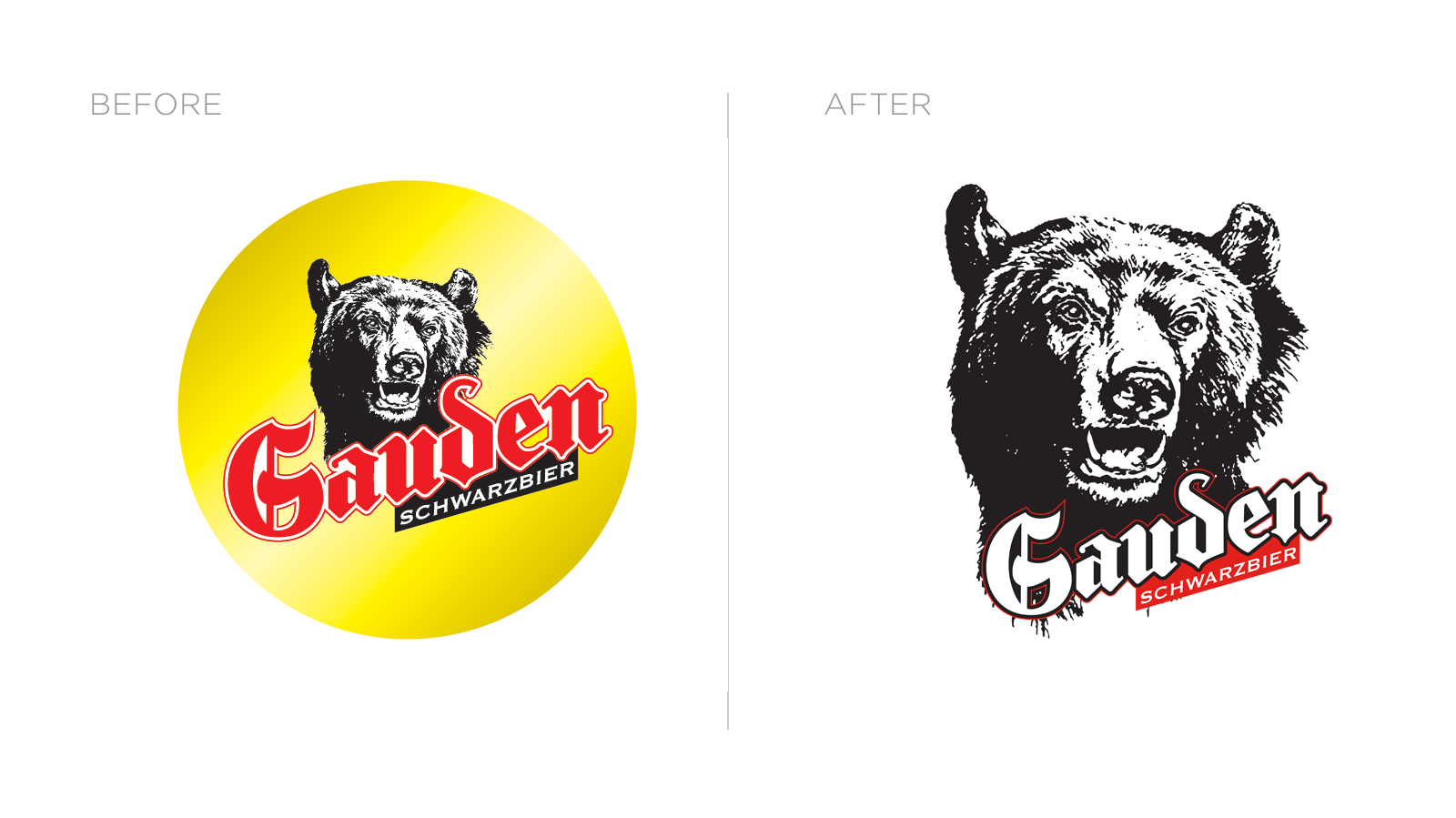
The current branding was old-fashioned, with a traditional gold background and old-fashioned Blackletter font. I worked with the client and encouraged them to look beyond "just" a logo.
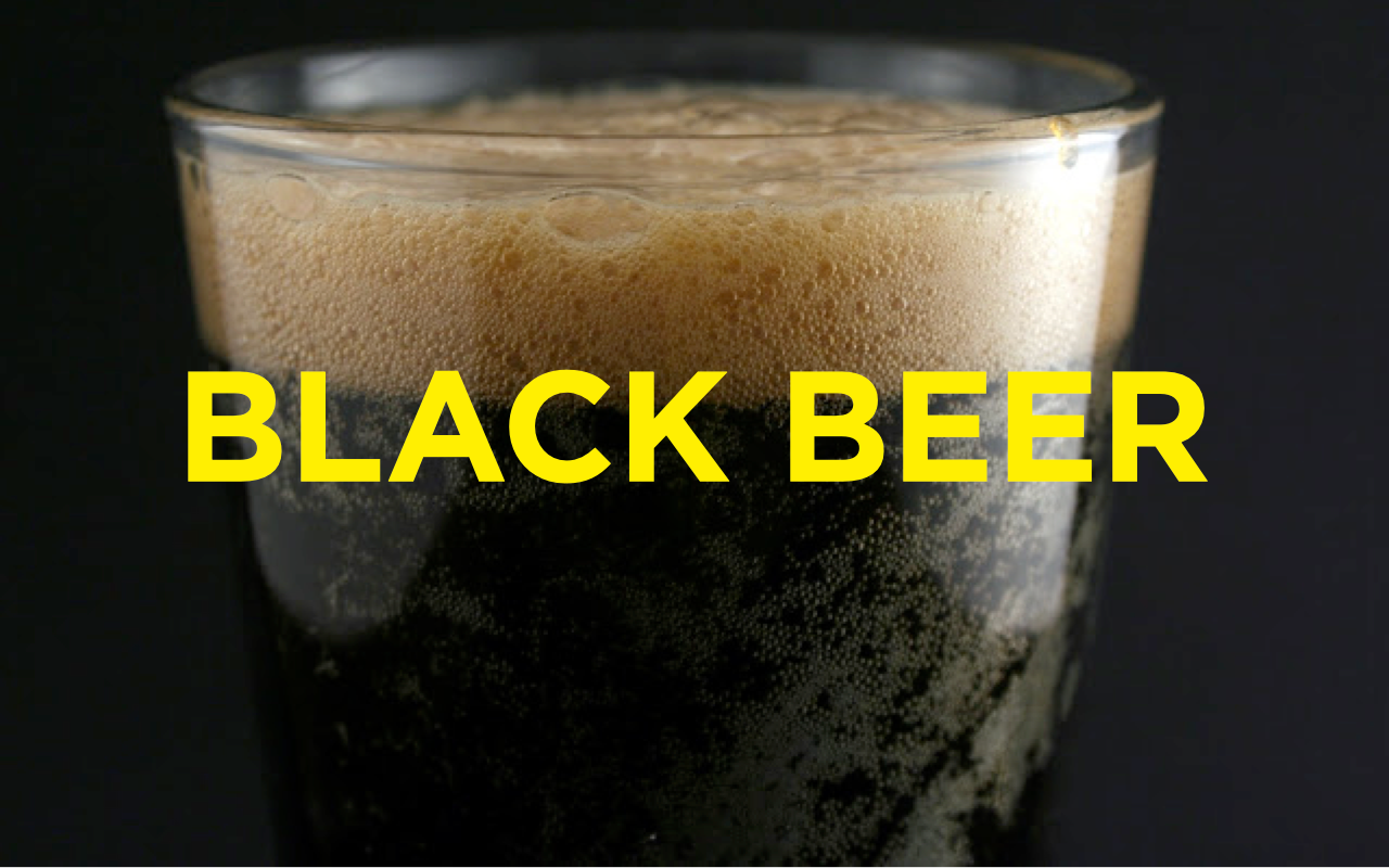
Gau Den means “Black Bear” in Vietnamese while the beer itself was a dark beer reminiscent of a traditional German schwarzbier. This offered numerous starting points for our brand story and strategy.
The client and I sat down to develop our brand story - what/who were we?
Were we all about the beer, all about the heritage, or were we all about the bear?

Based on the target market insight, we decided the bear would best embody the Brand.
He embodied the masculinity and virility of the brand, and would have an aggressive, in-your-face appearance and personality that would disrupt the market.


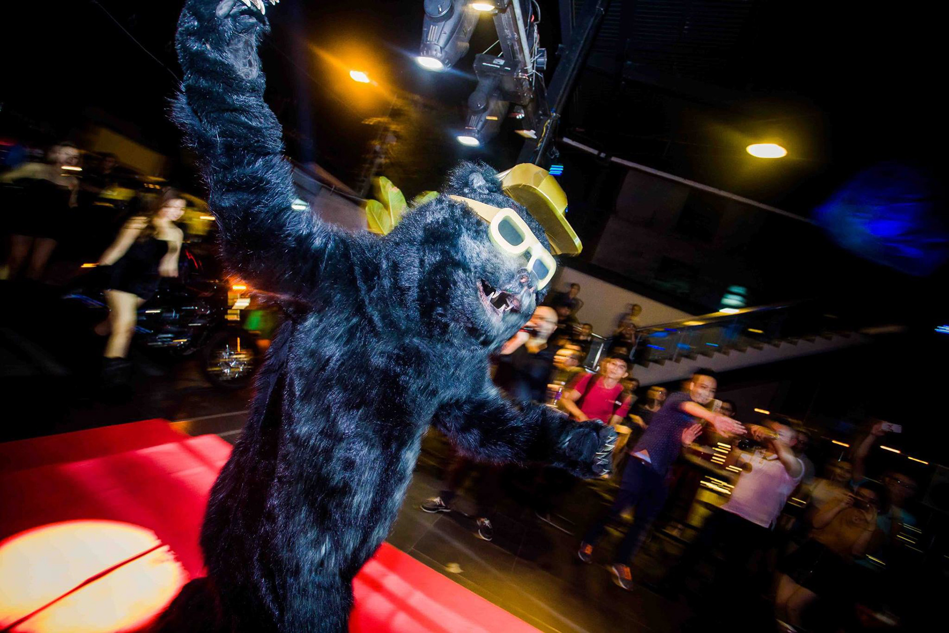
We executed a packaging design strategy encompassing cans, bottles, cartons, and various other point-of-sale and marketing material based on our brand strategy, and further brought our bear to life via various fun out-of-home activities, all with the bear at the heart of the action.