
A project that began as a simple signage upgrade blossomed into a comprehensive rebranding exercise that involved a revision of their Brand Identity as well as development of Brand Guidelines and Artwork Templates for implementation of the new Creative Strategy.
ACC approached us to help them refine their Signage for their existing clinic in Ho Chi Minh City.
After being in operation for over 10 years in Vietnam, ACC had significant Brand Recognition. But the market was getting more competitive, and with the grand opening of their newest and biggest clinic to date, ACC wanted to examine the effectiveness of their Signage.
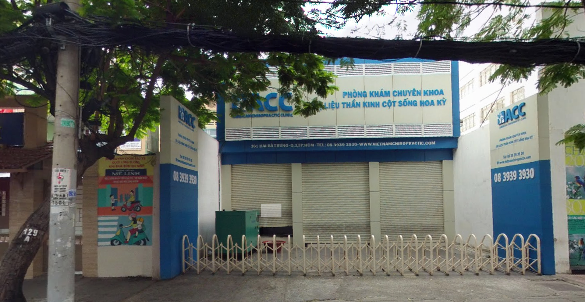
We began by looking at the Consumer Journey: how did people get to the clinic, and what was their experience in finding it?
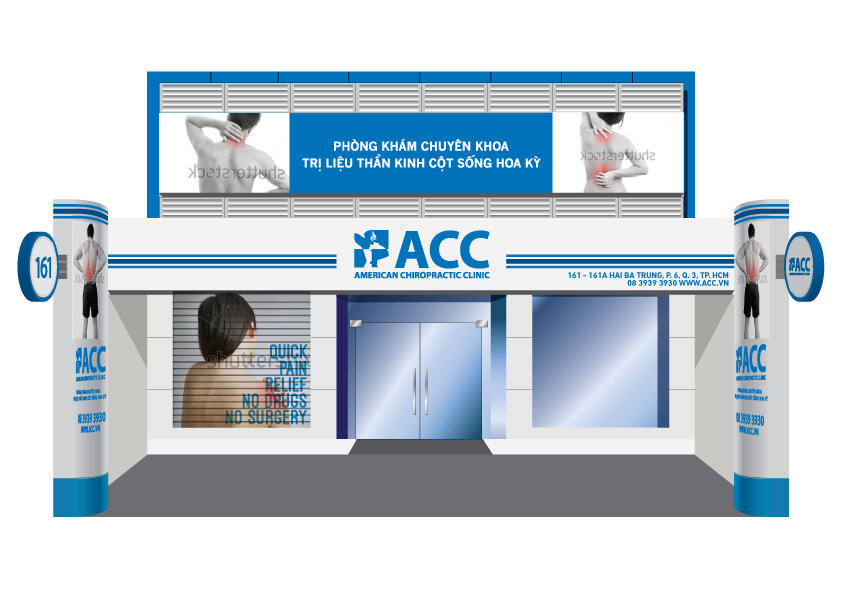
Based on our findings, we created a new, high-visibility Signage Design for ACC that built on their current Brand Equity and reinforced their Brand Identity.
Based on our findings, we created a new, high-visibility Signage Design for ACC that built on their current Brand Equity and reinforced their Brand Identity.
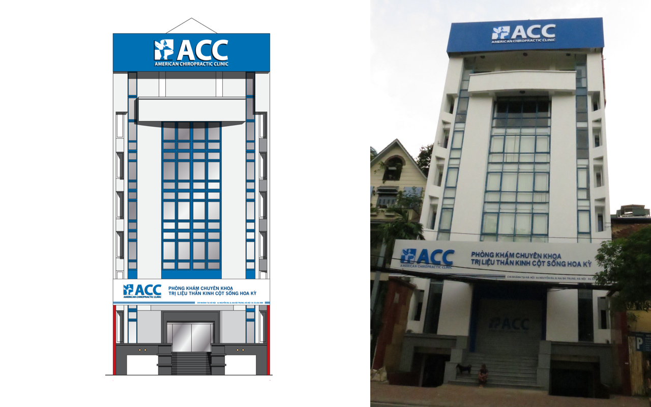
Based on the design for the clinic in Saigon, we adapted the key elements to create a distinctly ACC-branded facade and signage for ACC Hanoi.
This is to be the largest chiropractic clinic in Southeast Asia, with over 7 floors of space for chiropractic care, acupuncture, and other services.
ACC had a lot of existing Brand Equity in its current Brand Identity. They were reluctant to change for fear of alienating their current customers and/or possibly confusing current and prospective customers.
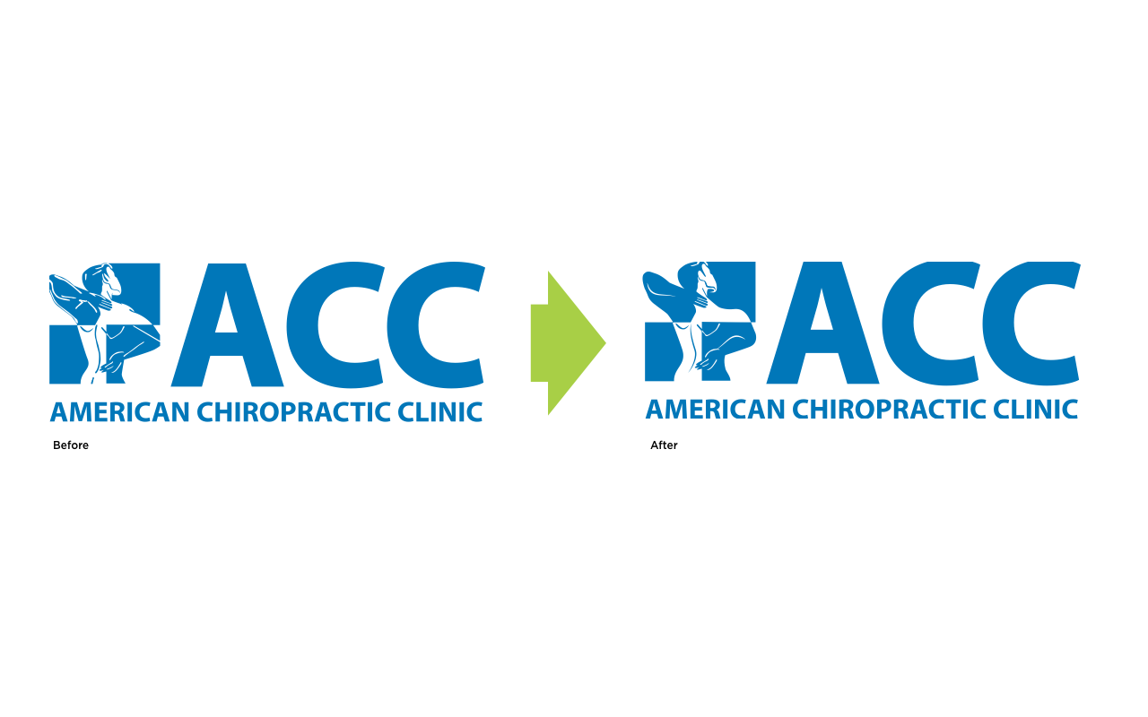
We proposed an identity upgrade over a 5-year period, starting with a minimal 10% revision aimed at cleaning up the minor details in the logo to make it easier to implement at smaller sizes.
ACC felt this approach had a lot of merit, and as they were about to launch their largest clinic in Hanoi, approved the upgrade to the Brand Identity for immediate implementation.
We worked closely with the Client to upgrade the Icon without losing the spirit behind the design, while retaining the key elements, such as the Brand Color and Typeface.
We rebuilt the Brand Mark, starting with the Icon, and developed a Brand Architecture that clearly defined the structure, positioning, and spacing of the various elements.
Large companies have a lot of employees. As such, there is always the danger of the Brand Identity changing as people change employers. This risks degrading the Brand as the Brand Visual Language changes, designs for marketing collateral change, or worse, as the Brand Identity is implemented poorly or improperly.
To prevent this, we developed a set of Brand Guidelines that codified use and implementation of not only the Brand Identity, but also design of various marketing collateral, ranging from brochures to standees to signage to business cards.
We developed a Brand Guidelines book that clearly defined the Brand Identity, Brand Color Palette, Brand Visual Language, Brand Imagery Language, and the design for brochures, etc.
This was a massive undertaking, requiring the redesign of multilingual brochures (English and Vietnamese), vouchers for special events, standees and flyers, signage, business cards and letterhead, envelopes and even orthotic shoe bags, among other items.
We followed this up by providing Artwork Templates for each item, clearly setting forth the guidelines for use of not only the layout, but also how to select and retouch photos to match ACC’s Visual Language.